Untangling Climate’s Complexity With A Transparent, Data-Driven Map

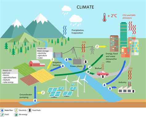
Untangling Climate’s Complexity is a tall order for policymakers, researchers, and communities. A transparent, data-driven map acts like a common language, turning disparate streams of climate data into a navigable visualization that highlights cause, effect, and uncertainty in one place. By integrating emissions data, land-use changes, weather patterns, and policy actions, the map helps readers see not just what is happening, but why it matters.
Key Points
- The map consolidates diverse data sources to reveal connections between emissions, land-use, and climate impacts.
- Transparent methodologies expose data provenance, processing steps, and uncertainty bounds to build trust.
- Interactivity enables users to explore scenarios and compare policy options in real time.
- Contextual storytelling guides interpretation without oversimplifying complex relationships.
- Open data standards promote reproducibility and collaboration across organizations.
Untangling Climate’s Complexity Through Community-Driven Insight

Engaging communities and practitioners in shaping the map’s features ensures it reflects real-world concerns. When users contribute regional data, validation checks, and local context, the map becomes a more accurate tool for prioritizing adaptation and mitigation actions.
Design principles for effectiveness
Effective climate maps balance depth with clarity. They emphasize transparency about data sources and methods, while delivering a user-friendly interface that supports quick, informed decisions. The map should empower users to ask questions, test hypotheses, and see how different choices ripple through time.
Clarity and prioritization
Limit layers to the most impactful drivers for the user’s context, and provide intuitive legends so readers can interpret results without specialist training.
Provenance and uncertainty
Each data layer includes sources, the date of last update, and visible uncertainty bounds. Where possible, offer simple sensitivity analyses so readers understand how conclusions might shift with data quality or assumptions.
Applying the map to real-world decisions
Urban planners can simulate the impact of energy transitions on local air quality and heat risk. Researchers can compare model ensembles under different climate scenarios, publish methods, and invite replication. For communities, the map can visualize trade-offs between development goals and environmental resilience.
From insight to action
Use the map to identify high-leverage interventions, communicate risks to stakeholders, and monitor progress over time as new data arrive.
Limitations and how to address them

All models carry uncertainty. The map should communicate ranges and confidence intervals openly, and offer clear explanations of data gaps. Regular updates, versioning, and governance help maintain reliability and foster ongoing trust.
What is the core idea behind Untangling Climate’s Complexity?
+The core idea is to present a single, transparent map that reveals how emissions, land use, weather, and policy actions interact, enabling clearer interpretation and smarter decisions.
How does transparency strengthen trust in climate data?
+Transparency shows data sources, processing steps, and uncertainty ranges. When users can trace a result back to its inputs, confidence in the conclusions rises.
What kinds of data power the map?
+Observational data on emissions, energy systems, land cover, meteorology, and policy actions—combined with model outputs and uncertainty estimates.
How can decision-makers use this map?
+Use the map to compare scenarios, prioritize interventions, and communicate risks to stakeholders. The objective is to inform actions, not prescribe them.
